When designing digital systems, one of the greatest challenges is making complex processes easy to understand at a glance. Users often interact with workflows that pass through multiple stages—submissions, reviews, approvals, or rejections. To help users quickly interpret these states, designers can leverage metaphors that are already intuitive in everyday life.
One effective solution is the traffic light metaphor for process representation. This approach uses universally recognized colors to indicate the status of a process, reducing the need for long explanations or detailed instructions.
How the Traffic Light Metaphor Works
The metaphor is built around familiar meanings of traffic light colors but adapted for digital process tracking:
-
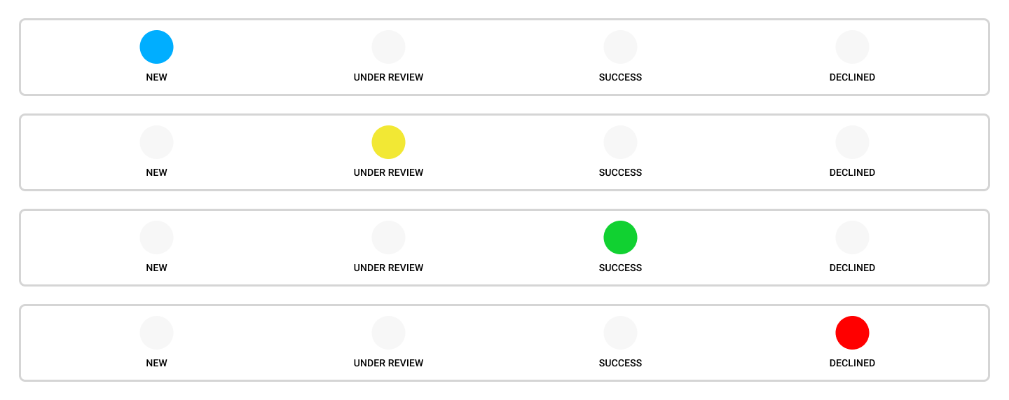
Blue – Process Started
Blue represents the initiation of the process. It signals that the request or task has been registered and is in motion. The choice of blue, instead of green, avoids confusion with the final “successful” state and gives a neutral, calm tone to the beginning of the process. The color representation can also be accompanied by labels like New, Beginning, etc. -
Yellow – Under Review
Just as a yellow light means “slow down and prepare,” in this metaphor, yellow indicates that the process is pending or under review. Users know that the system is actively considering or verifying the request. -
Green – Successful Completion
Green signals a satisfactory outcome. The process has been completed successfully, and the user can proceed confidently. The association with “go” is direct and immediate. -
Red – Unsuccessful Completion
Red communicates an unsuccessful or rejected outcome. Like stopping at a red light, it tells the user that the process has ended and cannot move forward without corrective action.
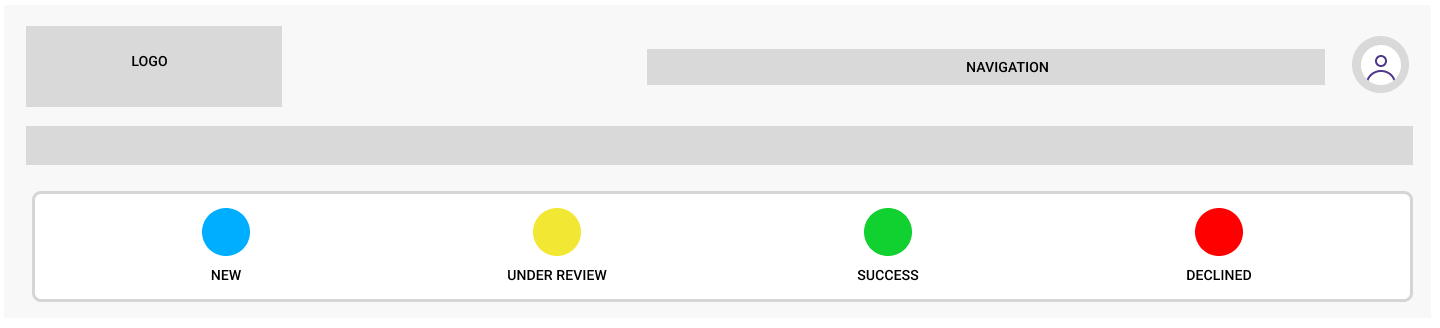
Example of horizontal layout
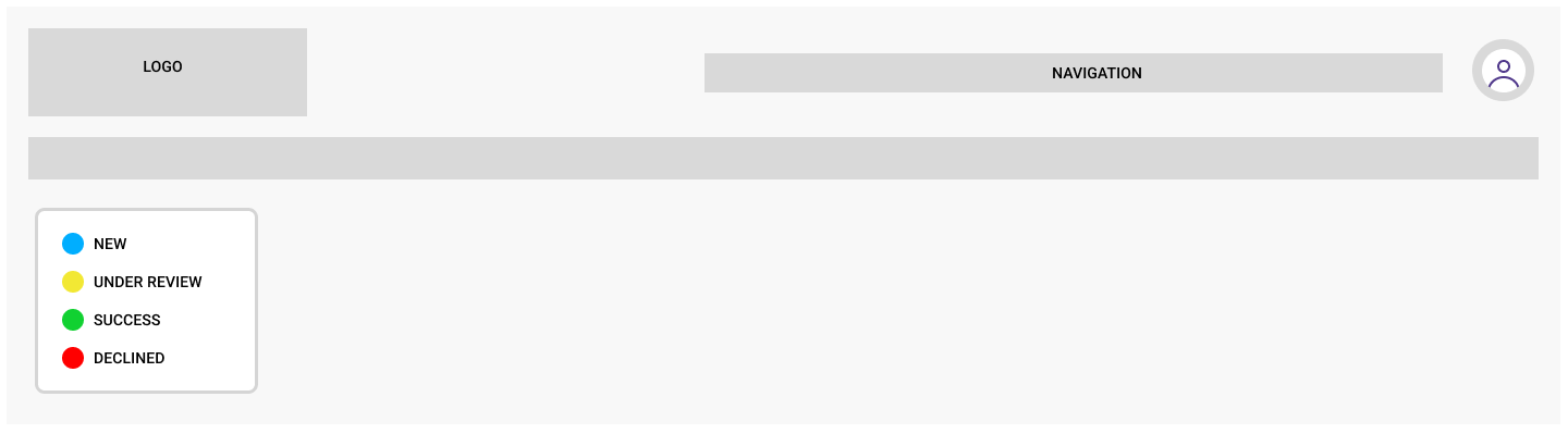
Example of vertical layout
Why This Metaphor Works
The traffic light metaphor works because it taps into a deeply embedded cultural understanding of color-coded signals. Most users already know what red, yellow, and green mean from their daily lives. By adding blue as the starting marker, designers make room for an extra status without disrupting the metaphor.
The benefits include:
-
Clarity at a glance – Users don’t need to read detailed labels to understand the status.
-
Consistency across systems – The metaphor is flexible enough to apply in finance, logistics, education, healthcare, and more.
-
Accessibility through familiarity – Even users with limited digital literacy can interpret the meaning of the colors.
Applications in Digital Systems
This functionality is particularly useful in systems where processes move through well-defined stages. For example:
-
Government services – Permit applications moving from submission, to review, to approval or denial.
-
E-commerce – Orders progressing through confirmation, processing, successful delivery, or cancellation.
-
Project management tools – Tasks tracked from initiation, evaluation, completion, or blockage.
Example of use
Neutral / Professional Labels
-
Blue: Process Started / Submitted / Initiated
-
Yellow: Under Review / Pending Review / In Progress
-
Green: Approved / Completed Successfully / Process Finished
-
Red: Rejected / Failed / Unsuccessful
Friendly / User-Centered Labels
-
Blue: We’ve Received Your Request / Process Began / Starting Up
-
Yellow: Hang Tight, We’re Reviewing / Currently in Progress / Being Checked
-
Green: All Set! / Completed with Success / You’re Good to Go
-
Red: Something Went Wrong / Not Approved / Needs Attention
Action-Oriented Labels
-
Blue: Submission Recorded
-
Yellow: Awaiting Review
-
Green: Approved – Proceed
-
Red: Rejected – Please Revise
Short UI-Friendly Labels (ideal for icons, tooltips, or dashboards)
-
Blue: Started
-
Yellow: Reviewing
-
Green: Done
-
Red: Error
Final Thoughts
Representing processes is essential in digital interfaces, especially when users depend on clear system feedback. The traffic light metaphor is a simple yet powerful way to convey process statuses. Leveraging color-coded signals that people already understand allows designers to create effective, low-cognitive-load interfaces.
The goal is to display information in a way that feels natural, immediate, and trustworthy. With the traffic light metaphor, processes become as clear as the signals we see every day on the road.